click for larger view
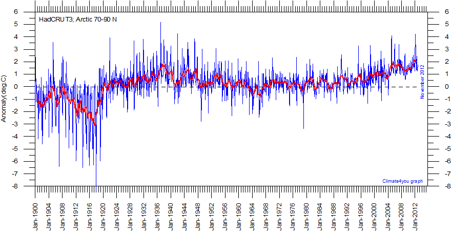
Diagram showing Arctic monthly surface air temperature anomaly 70-90oN since January 1900, in relation to the WMO normal period 1961-1990. The thin blue line shows the monthly temperature anomaly, while the thicker red line shows the running 13 month average. In general, the range of monthly temperature variations decreases throughout the first 30-50 years of the record, reflecting the increasing number of meteorological stations north of 70oN over time. Especially the period from about 1930 saw the establishment of many new Arctic meteorological stations, first in Russia and Siberia, and following the 2nd World War, also in North America. Because of the relatively small number of stations before 1930, details in the early part of the Arctic temperature record should not be over interpreted. The rapid Arctic warming around 1920 is, however, clearly visible, and is also documented by other sources of information. The period since 2000 is warm, about as warm as the period 1930-1940. Diagrams showing more recent variations of Arctic temperatures north of 70oN in greater detail are shown here, here and here. Data source: HadCRUT3 temperature data from the Climatic Research Unit (CRU). Last month shown: March 2009. Last diagram update 9 May 2009.
More...
No comments:
Post a Comment